
News + Thought
Why minimalism still wins in luxury design
My recent article about Pantone’s Colour of the Year sparked some debate with the team after we posted it. Not so much about the colour itself (we all agreed it had about as much charisma as the M25), but about what it hinted at more broadly.
A few people felt luxury design was shifting away from restraint; that louder visuals were now what felt premium. Others asked whether minimalism had really lost its relevance at all.
At the heart of the issue is that luxury design is often called “subjective,” and to an extent, that’s true. But the one idea which keeps showing up again and again, across countries, cultures, and platforms, is that the brands that feel truly premium are the ones brave enough to do less.
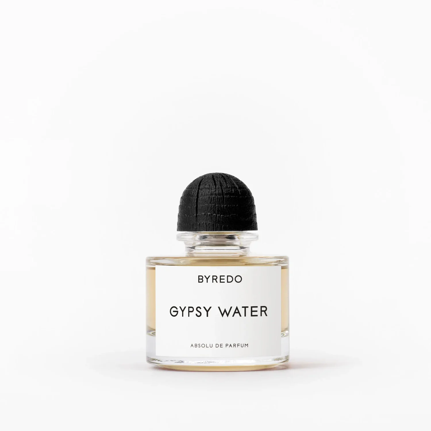
Minimalism continues to dominate the luxury space not because it’s trendy, but because it says something deeper about craftsmanship, intention, and control. In luxury, meaning is rarely shouted - it’s whispered. Restraint is a signal of confidence that no amount of ornamentation can match.
Image source: Byredo
When a brand embraces minimalism, it’s making a statement: every detail that remains has been chosen deliberately. Nothing is there just by accident. That careful precision reads as carefully crafted mastery - showing that the product, the story, and the brand don’t need extra decoration to hold attention.
Space matters too. Luxury is defined as much by what’s left out as by what’s included. Claude Debussy once said, “Music is the silence in between the notes,” and the same is true in design. Negative space, muted palettes, and clean structures give the eye room to breathe – something very rare in today’s noisy digital world.
While most brands compete to be louder, those that hold back naturally stand apart. Silence becomes a form of distinction, and minimalism shapes perception in subtle ways.
Turns out that I’m not alone in this line of thinking - researchers at Yale found visual clutter actively disrupts how efficiently the brain processes information.
When the visual field is crowded, neurons in the visual cortex compete with one another, suppressing signal clarity and forcing the brain to work harder simply to make sense of what it’s seeing. Even when we think we’re ignoring clutter, our visual system is still processing it subconsciously, consuming cognitive resources in the background.
In contrast, restrained design reduces that competition. The eye moves more easily, attention settles more naturally, and the experience feels calmer, clearer, and more controlled - and these are all qualities we instinctively associate with luxury, making the fit natural.
Timelessness is another reason minimalism remains the default language of luxury. Trends come and go, and maximalist visuals can feel outdated almost instantly. Minimalist design avoids gimmicks, flashy fonts, or heavy graphics. Instead, it leans into a style that stays elegant and coherent over the years. For heritage-driven brands, it’s that consistency which so staunchly reinforces both credibility and trust.
This allows the product - and the brand - to stand unchallenged at the centre of the experience. When everything unnecessary is removed, what matters becomes impossible to ignore.
Minimalism may seem quiet, but in the world of luxury, it will continue to speak volumes.


